Let’s Drone Out is a light-hearted and chatty drone focused podcast. Recorded live and interactively every Thursday 8-9 pm UK time on YouTube, come join the interactive chat. Jack and his wife Tony, as well as the rest of the LDO crew are here to bring noobs and pros together. Tune in every Thursday at 8:00PM UK time for the latest on tech, events, news, interviews and a behind the scenes look into the hobby. LEGAL NOTICE: Any views expressed by any guests on this show are personal and may ...
…
continue reading
תוכן מסופק על ידי Planet Xamarin. כל תוכן הפודקאסטים כולל פרקים, גרפיקה ותיאורי פודקאסטים מועלים ומסופקים ישירות על ידי Planet Xamarin או שותף פלטפורמת הפודקאסט שלהם. אם אתה מאמין שמישהו משתמש ביצירה שלך המוגנת בזכויות יוצרים ללא רשותך, אתה יכול לעקוב אחר התהליך המתואר כאן https://he.player.fm/legal.
דומה לPlanet Xamarin
Show notes are at https://stevelitchfield.com/sshow/chat.html
…
continue reading
The official podcast of GamersWithJobs.com, the GWJCC is our way of providing a podcast that feels like you are hanging out with friends after a long day in the office. We strive for smart, in-depth discussions about the latest games and gaming-related news, as well as light, playful tangents. We're always thrilled to talk about the new hotness, explore fun and strange indie gems, and revisit games old and new.
…
continue reading
This is the audio podcast version of Troy Hunt's weekly update video published here: https://www.troyhunt.com/tag/weekly-update/
…
continue reading
We Like Dota is a podcast about the casual Dota 2 scene, with segments such as the Hero and Item of the Week, E-Sports coverage, and Noobs Ask Noobs questions.
…
continue reading
An independent radio station from Tel Aviv. For music lovers by music lovers.
…
continue reading
We promise we are not as Horrible as you think at video games, well maybe. This is a podcast based on current video game culture and much more. Join us for a whole new experience with gaming, we’re not your average gamers we are The Horrible Gamers!
…
continue reading
DISQO’s podcast features the brightest minds fueling product teams. Subscribe to learn how product management and strategy are being driven by putting customer experience (CX) front and center. Learn more and subscribe at tipm.feedbackloop.com
…
continue reading
Audio home of The Jimquisition, featuring its lovely little podcast, Podquisition - starring Jim Sterling, Laura Kate, and Conrad Zimmerman!
…
continue reading
Exploring React Native Together
…
continue reading
Player FM - אפליקציית פודקאסט
התחל במצב לא מקוון עם האפליקציה Player FM !
התחל במצב לא מקוון עם האפליקציה Player FM !

))
MAUI UI July – Replicating F1TV app
סדרה בארכיון ("עדכון לא פעיל" status)
When?
This feed was archived on October 14, 2022 03:43 (
Why? עדכון לא פעיל status. השרתים שלנו לא הצליחו לאחזר פודקאסט חוקי לזמן ממושך.
What now? You might be able to find a more up-to-date version using the search function. This series will no longer be checked for updates. If you believe this to be in error, please check if the publisher's feed link below is valid and contact support to request the feed be restored or if you have any other concerns about this.
Manage episode 333412603 series 1648189
תוכן מסופק על ידי Planet Xamarin. כל תוכן הפודקאסטים כולל פרקים, גרפיקה ותיאורי פודקאסטים מועלים ומסופקים ישירות על ידי Planet Xamarin או שותף פלטפורמת הפודקאסט שלהם. אם אתה מאמין שמישהו משתמש ביצירה שלך המוגנת בזכויות יוצרים ללא רשותך, אתה יכול לעקוב אחר התהליך המתואר כאן https://he.player.fm/legal.
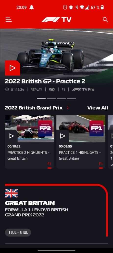
For .NET MAUI UI July, I decided to replicate another app using .NET MAUI. The choice this time landed on the F1TV app, the official app to watch all Formula 1 races on.
Here’s a screenshot of the F1TV app running on Android:
Although there are other pages in this app, this main page is the one that I will be replicating in this post. For purposes of demonstration I haven’t gotten the correct logos and fonts, but focused primarily on the layout and the controls.
Getting started
For the icons I decided to use the Material design font icons, since they have pretty similar icons to the ones in the app. I used this video by Karl Searl on how to easily use the icons in a .NET MAUI app.
Since I’m primarily testing on an Android emulator, I had to edit the Android specific styling for the status bar in colors.xml under Platforms -> Android -> Resources -> values. I set this to the same color as the top section:
#e10600 #e10600 #e10600 In the MAUI XAML page, I’ve set the background color for the ContentPage to be that of the design. I’ve also set an implicit style to set the text color of all labels to white.
At the top level, I have a ScrollView with a VerticalStackLayout inside that.
... Top section
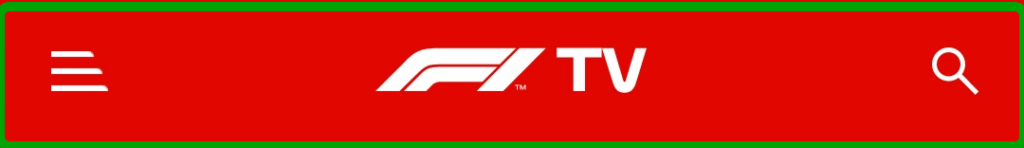
The top section consists of a menu button, a logo and a search button. We’ll use a FlexLayout here with SpaceBetween to position the child elements at the start and end. We’ll use Image at the start and end to show the icons and a Label in the middle to show the logo. Had I done this properly, this probably would also be an Image.
![]()
![]()
Carousel section
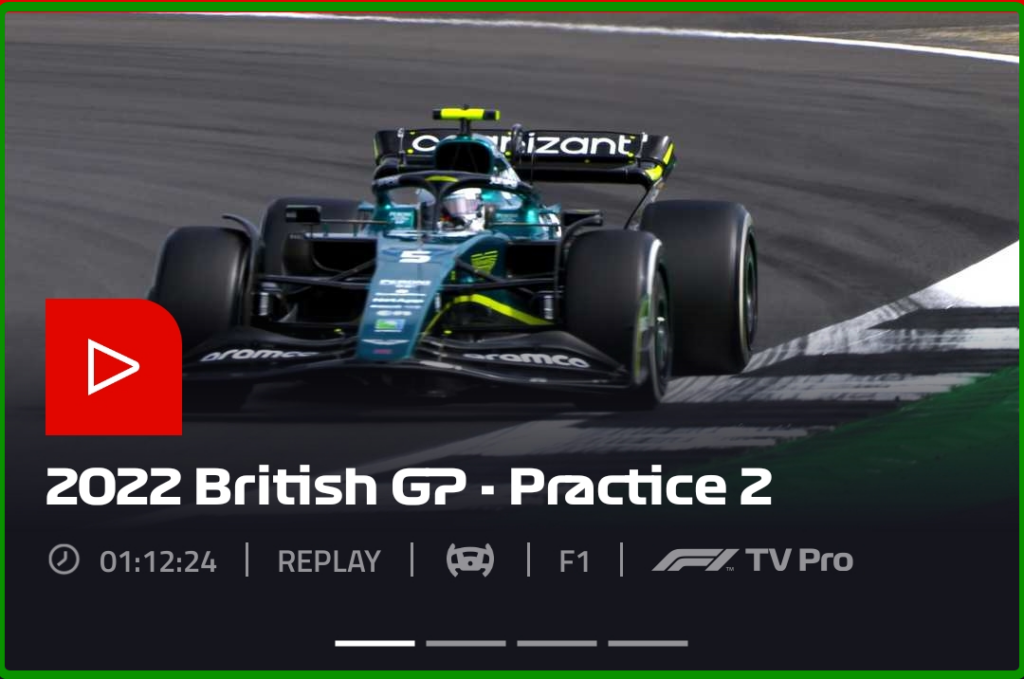
The carousel section shows the four most relevant races/videos in a carousel. I must admit that I cheated a bit here, since the most natural choice here would be to use a CarouselView. I opted to fake it for purposes of demonstration, but the layout would be very much reused for the item template if I had done it properly.
Nonetheless, this section consists of a few things: the image, the play button, the title, the “tags” and the indicator. Since there is a lot of overlapping elements here, we start with a Grid, which allows us to stack controls on top of each other.
The first element will be the Image background. Since the image seems to fade into the background color, we’ll add a gradient to the image. One of the ways to do this is to add a Frame on top of the image and set a LinearGradientBrush on it.
![]()
For the play button, we’ll use a Border with a font icon as a child element. With the Border control we can set individual corner radius for each corner using the StrokeShape.
![]()
The title is just a Label that we stick to the bottom left.
The “tags” are contained in a HorizontalStackLayout which is outside of the Grid, since they’re below the picture, and they consist of a combination of Image and Label controls.
![]()
![]()
The indicators were made able by some Line controls inside a centered HorizontalStackLayout. If I were to do it the correct way, I would have used an IndicatorView which would be connected to the CarouselView.
Middle section
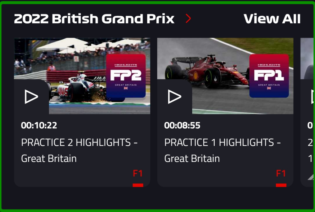
The middle section shows the current Grand Prix along with the option to view all videos and swipe among a few of them.
The header part was achieved with a FlexLayout along with some labels inside that.
For the horizontal list, I used a CollectionView with ItemsLayout set to HorizontalList. The item template for the list uses a Border as the parent element. With this we can set the rounded corners at the bottom of the view. Inside that, we have a Grid with two rows where the top part consists of the image and play button and the bottom part contains some text.
... The top part of the template:
![]()
![]()
Note that I had to set some negative values for the margins, since the image didn’t seem to fill the parent element fully without it.
The bottom part of the template:
For the sake of this example I hardcoded a list as the items source for the CollectionView. The easiest way to do this was to add dummy items directly into the XAML.
test test test Bottom section
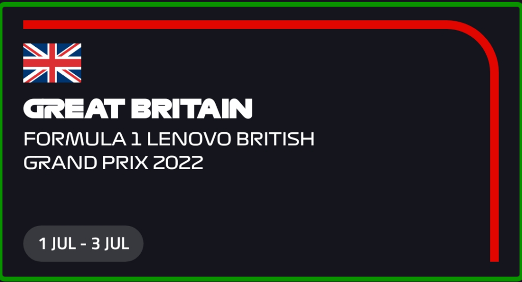
The bottom section is a bit of a info section regarding the current Grand Prix.
For the red line, I thought about trying to recreate it with some LineGeometry or PathGeometry, but I took the easy way out and saved it as a transparent PNG instead. I then used a Grid to set the image as the background and a VerticalStackLayout on top of that. The “pill” thing at the bottom was achieved with the Border control (yes I really like the Border control!).
![]()
Done!
That concludes the replication of the F1TV app! Here’s a short video of the thing running on an Android emulator:
That’s it for my contribution to the MAUI UI July, which was initiated by Matt Goldman. Stay tuned on Twitter this month for all the contributions to come! The sample code for the F1TV app is located on my GitHub if you want to check it out.
The post MAUI UI July – Replicating F1TV app appeared first on Andreas Nesheim.
252 פרקים
 שתפו
שתפו
סדרה בארכיון ("עדכון לא פעיל" status)
When?
This feed was archived on October 14, 2022 03:43 (
Why? עדכון לא פעיל status. השרתים שלנו לא הצליחו לאחזר פודקאסט חוקי לזמן ממושך.
What now? You might be able to find a more up-to-date version using the search function. This series will no longer be checked for updates. If you believe this to be in error, please check if the publisher's feed link below is valid and contact support to request the feed be restored or if you have any other concerns about this.
Manage episode 333412603 series 1648189
תוכן מסופק על ידי Planet Xamarin. כל תוכן הפודקאסטים כולל פרקים, גרפיקה ותיאורי פודקאסטים מועלים ומסופקים ישירות על ידי Planet Xamarin או שותף פלטפורמת הפודקאסט שלהם. אם אתה מאמין שמישהו משתמש ביצירה שלך המוגנת בזכויות יוצרים ללא רשותך, אתה יכול לעקוב אחר התהליך המתואר כאן https://he.player.fm/legal.
For .NET MAUI UI July, I decided to replicate another app using .NET MAUI. The choice this time landed on the F1TV app, the official app to watch all Formula 1 races on.
Here’s a screenshot of the F1TV app running on Android:
Although there are other pages in this app, this main page is the one that I will be replicating in this post. For purposes of demonstration I haven’t gotten the correct logos and fonts, but focused primarily on the layout and the controls.
Getting started
For the icons I decided to use the Material design font icons, since they have pretty similar icons to the ones in the app. I used this video by Karl Searl on how to easily use the icons in a .NET MAUI app.
Since I’m primarily testing on an Android emulator, I had to edit the Android specific styling for the status bar in colors.xml under Platforms -> Android -> Resources -> values. I set this to the same color as the top section:
#e10600 #e10600 #e10600 In the MAUI XAML page, I’ve set the background color for the ContentPage to be that of the design. I’ve also set an implicit style to set the text color of all labels to white.
At the top level, I have a ScrollView with a VerticalStackLayout inside that.
... Top section
The top section consists of a menu button, a logo and a search button. We’ll use a FlexLayout here with SpaceBetween to position the child elements at the start and end. We’ll use Image at the start and end to show the icons and a Label in the middle to show the logo. Had I done this properly, this probably would also be an Image.
![]()
![]()
Carousel section
The carousel section shows the four most relevant races/videos in a carousel. I must admit that I cheated a bit here, since the most natural choice here would be to use a CarouselView. I opted to fake it for purposes of demonstration, but the layout would be very much reused for the item template if I had done it properly.
Nonetheless, this section consists of a few things: the image, the play button, the title, the “tags” and the indicator. Since there is a lot of overlapping elements here, we start with a Grid, which allows us to stack controls on top of each other.
The first element will be the Image background. Since the image seems to fade into the background color, we’ll add a gradient to the image. One of the ways to do this is to add a Frame on top of the image and set a LinearGradientBrush on it.
![]()
For the play button, we’ll use a Border with a font icon as a child element. With the Border control we can set individual corner radius for each corner using the StrokeShape.
![]()
The title is just a Label that we stick to the bottom left.
The “tags” are contained in a HorizontalStackLayout which is outside of the Grid, since they’re below the picture, and they consist of a combination of Image and Label controls.
![]()
![]()
The indicators were made able by some Line controls inside a centered HorizontalStackLayout. If I were to do it the correct way, I would have used an IndicatorView which would be connected to the CarouselView.
Middle section
The middle section shows the current Grand Prix along with the option to view all videos and swipe among a few of them.
The header part was achieved with a FlexLayout along with some labels inside that.
For the horizontal list, I used a CollectionView with ItemsLayout set to HorizontalList. The item template for the list uses a Border as the parent element. With this we can set the rounded corners at the bottom of the view. Inside that, we have a Grid with two rows where the top part consists of the image and play button and the bottom part contains some text.
... The top part of the template:
![]()
![]()
Note that I had to set some negative values for the margins, since the image didn’t seem to fill the parent element fully without it.
The bottom part of the template:
For the sake of this example I hardcoded a list as the items source for the CollectionView. The easiest way to do this was to add dummy items directly into the XAML.
test test test Bottom section
The bottom section is a bit of a info section regarding the current Grand Prix.
For the red line, I thought about trying to recreate it with some LineGeometry or PathGeometry, but I took the easy way out and saved it as a transparent PNG instead. I then used a Grid to set the image as the background and a VerticalStackLayout on top of that. The “pill” thing at the bottom was achieved with the Border control (yes I really like the Border control!).
![]()
Done!
That concludes the replication of the F1TV app! Here’s a short video of the thing running on an Android emulator:
That’s it for my contribution to the MAUI UI July, which was initiated by Matt Goldman. Stay tuned on Twitter this month for all the contributions to come! The sample code for the F1TV app is located on my GitHub if you want to check it out.
The post MAUI UI July – Replicating F1TV app appeared first on Andreas Nesheim.
252 פרקים
כל הפרקים
×
ברוכים הבאים אל Player FM!
Player FM סורק את האינטרנט עבור פודקאסטים באיכות גבוהה בשבילכם כדי שתהנו מהם כרגע. זה יישום הפודקאסט הטוב ביותר והוא עובד על אנדרואיד, iPhone ואינטרנט. הירשמו לסנכרון מנויים במכשירים שונים.
דומה לPlanet Xamarin
Let’s Drone Out is a light-hearted and chatty drone focused podcast. Recorded live and interactively every Thursday 8-9 pm UK time on YouTube, come join the interactive chat. Jack and his wife Tony, as well as the rest of the LDO crew are here to bring noobs and pros together. Tune in every Thursday at 8:00PM UK time for the latest on tech, events, news, interviews and a behind the scenes look into the hobby. LEGAL NOTICE: Any views expressed by any guests on this show are personal and may ...
…
continue reading
Show notes are at https://stevelitchfield.com/sshow/chat.html
…
continue reading
The official podcast of GamersWithJobs.com, the GWJCC is our way of providing a podcast that feels like you are hanging out with friends after a long day in the office. We strive for smart, in-depth discussions about the latest games and gaming-related news, as well as light, playful tangents. We're always thrilled to talk about the new hotness, explore fun and strange indie gems, and revisit games old and new.
…
continue reading
This is the audio podcast version of Troy Hunt's weekly update video published here: https://www.troyhunt.com/tag/weekly-update/
…
continue reading
We Like Dota is a podcast about the casual Dota 2 scene, with segments such as the Hero and Item of the Week, E-Sports coverage, and Noobs Ask Noobs questions.
…
continue reading
An independent radio station from Tel Aviv. For music lovers by music lovers.
…
continue reading
We promise we are not as Horrible as you think at video games, well maybe. This is a podcast based on current video game culture and much more. Join us for a whole new experience with gaming, we’re not your average gamers we are The Horrible Gamers!
…
continue reading
DISQO’s podcast features the brightest minds fueling product teams. Subscribe to learn how product management and strategy are being driven by putting customer experience (CX) front and center. Learn more and subscribe at tipm.feedbackloop.com
…
continue reading
Audio home of The Jimquisition, featuring its lovely little podcast, Podquisition - starring Jim Sterling, Laura Kate, and Conrad Zimmerman!
…
continue reading
Exploring React Native Together
…
continue reading
Player FM - אפליקציית פודקאסט
התחל במצב לא מקוון עם האפליקציה Player FM !
התחל במצב לא מקוון עם האפליקציה Player FM !